
We all read the words! We all love the words!
You could go so far as to say that we love the letters themselves!
So, it comes as no surprise that we readers love to see the letters begin beautified to the max on the cover!
Those medieval monks were onto something with their big fancy lettering…
They knew we would like that…
It will come as no surprise to you folks that todays’ Top Ten Tuesday prompt had me buzzing!!!!!
Top Ten Tuesday is a weekly bookish meme, hosted by the lovely Jana @ That Artsy Reader Girl, in which readers and bloggers come together to squeal, cry and ooo ‘n’ aaa at books.
Sorcery of Thorns by Margaret Rogerson
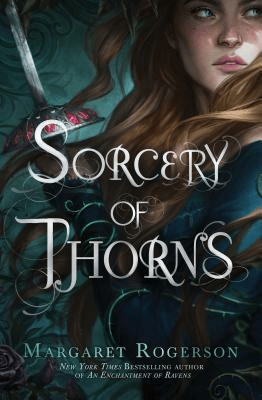

WHEWWWWWWW!!!!!
I was already excited for this book back before it was released, I adored Margaret Rogersons’ first book An Enchantment of Ravens so I was already ready to duel someone for her next book!
And then I saw this cover…
WHEN I TELL YOU I BROKE THE SOUND BARRIER!! THE SCREAM I SCRUMPT WAS DEADLY!!!
The curly wurly writing matches the thorns decorating the cover. I look at that font and I’m like “What other font could they have used really???”
Also this book was amazing!! (I do have a review up and I just reread it ??? what was I doing all those years ago??? I just talked about the characters?? I suppose it is spoiler free though!! My review!)
The Darkest Part of the Forest by Holly Black
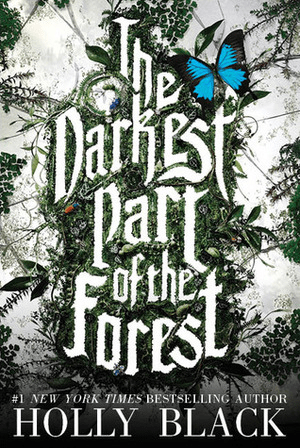
When I tell you this one made me stop in my tracks… Quite literally!
Let me set the scene!
There I was… In the year 2015…
A whole 15 years old, living off of books from my school library dreaming of having a library of my own.
I walk into a bookstore. I’m about to bee line to the Teen Fiction section, when something in the new releases catches my eye!
I diverted my course. Moving so fast I was actually levitating.
And here she was.
With everything you could want!
IT’S GOT THE PLANTS! IT’S GOT THE WORD FOREST ON IT (tbh that was enough to get my interest)!!!
I still looooove the way it looks like the plants are squished in the middle, like they could have grown out but they were like “naaaaaaaah these letters are delicious!”
10/10 cover! 10/10 title design!
Emily Wilde’s Encyclopaedia of Faeries by Heather Fawcett
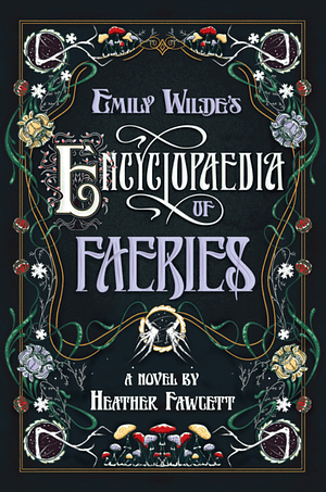
Something about lettering that looks both old timey and super whimsical always calls to me! I also ADORE the way the writing is framed!
I haven’t read this book yet, but I’m already enjoying it! Just reading that beautifully written title on that absolutely delicious cover!
A FEAST FOR THE EYES!
The Price Guide to the Occult by Leslye Walton
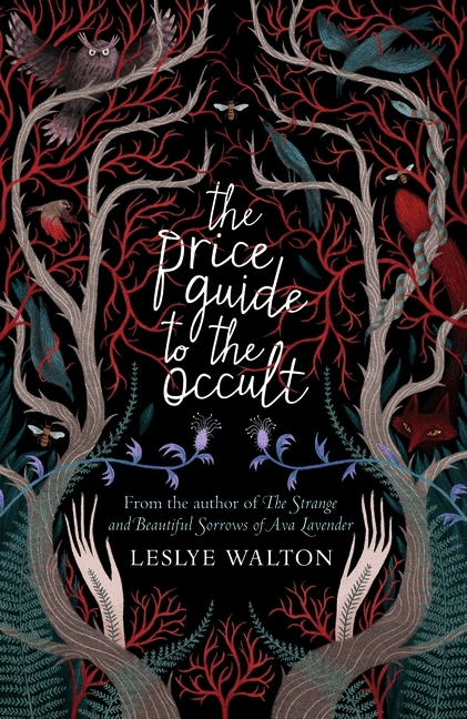

I know you saw the branches and knew exactly why this was on here…
The cursive font being all tabled up in the branches!!!!!!!!!!!!
LOVE!!!!
Violet Thistlewaite is Not a Villain Anymore by Emily Krempholtz
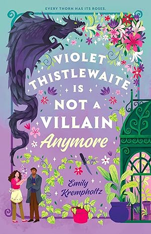
Usually when a cover had the title in two different fonts it looks a bit messy but this…

ALSO THE COVER!!!!! The gentle whimsy of it. The greenhouse! The plants! THE DRAGON!!!! THE DRAGON SPEWING PLANTS!!!!
It’s so obvious why I’m so there for this beAUTY!
The Tales of Arcana Fortune by Hafsa. A. Jawad
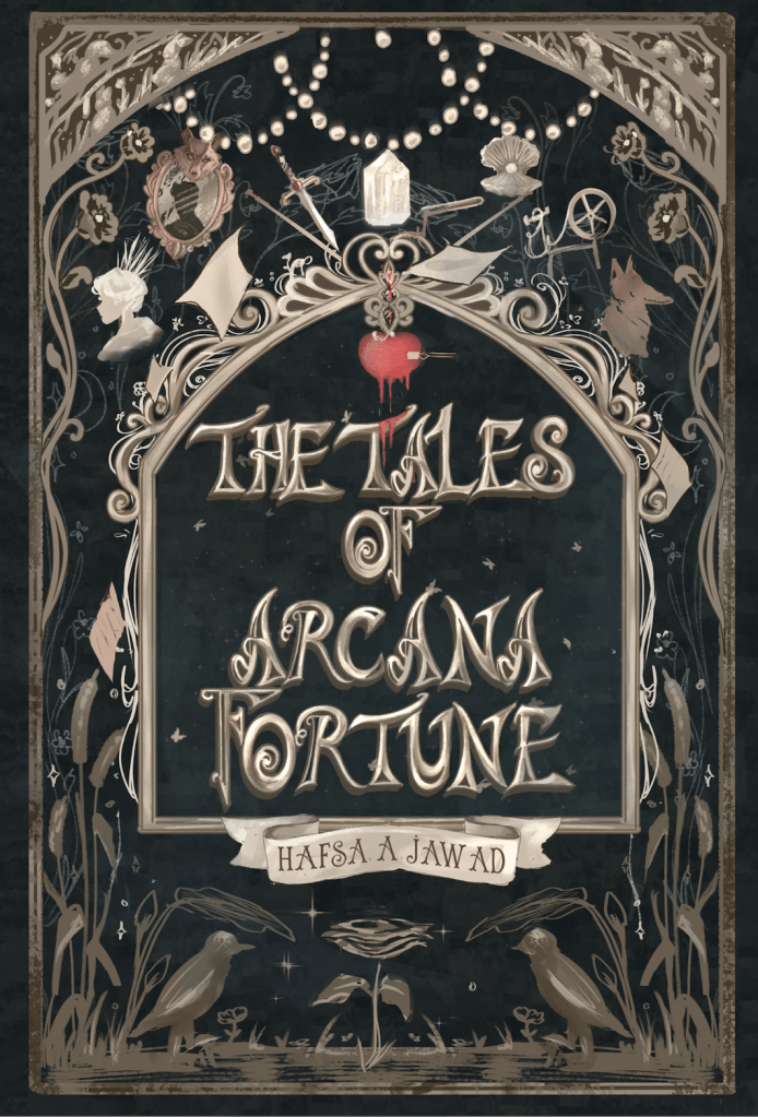
This ones title has such a fairy tale sharpness to it that I feel like a wizard just holding this book. This cover is just so gorgeous. It makes me feel so many emotions and also the synopsis makes this book sound like a book that I want to mould my whole personality around. Will be devouring this book within the next few weeks.
Will let you know if it is as delicious as it looks!!!
I mean it’s delicious enough already tbh…
What fonts do you like to see on book covers?? The Curly WurlyTM ?? The Simple yet bold?? Have you read any of these books before and if so was the writing on the inside as beautiful as the writing on the outside??

I have never seen that cover for Leslye Walton’s book but it is so eye-catching. I also love the typography for Arcana Fortune. Looking it up based on the cover alone. Great picks!
LikeLike
These are all beautiful! Great choices.
Happy TTT (on a Thursday)!
Susan
http://www.blogginboutbooks.com
LikeLike
I really enjoyed reading Sorcery of Thorns, and the font is lovely on the cover
Thanks for sharing your #TTT
LikeLiked by 1 person
Me too, I really liked Margaret Rogersons’ first book, but reading Sorcery of Thorns had me doing heart eyes and I knew I just had to get my hands on anything she writes!
LikeLike
I love the typography of The Tales of Arcana Fortune.
LikeLike
I love the typography of The Tales of Arcana Fortune.
LikeLiked by 1 person
I know right! Absolutely gorgeous!
LikeLike